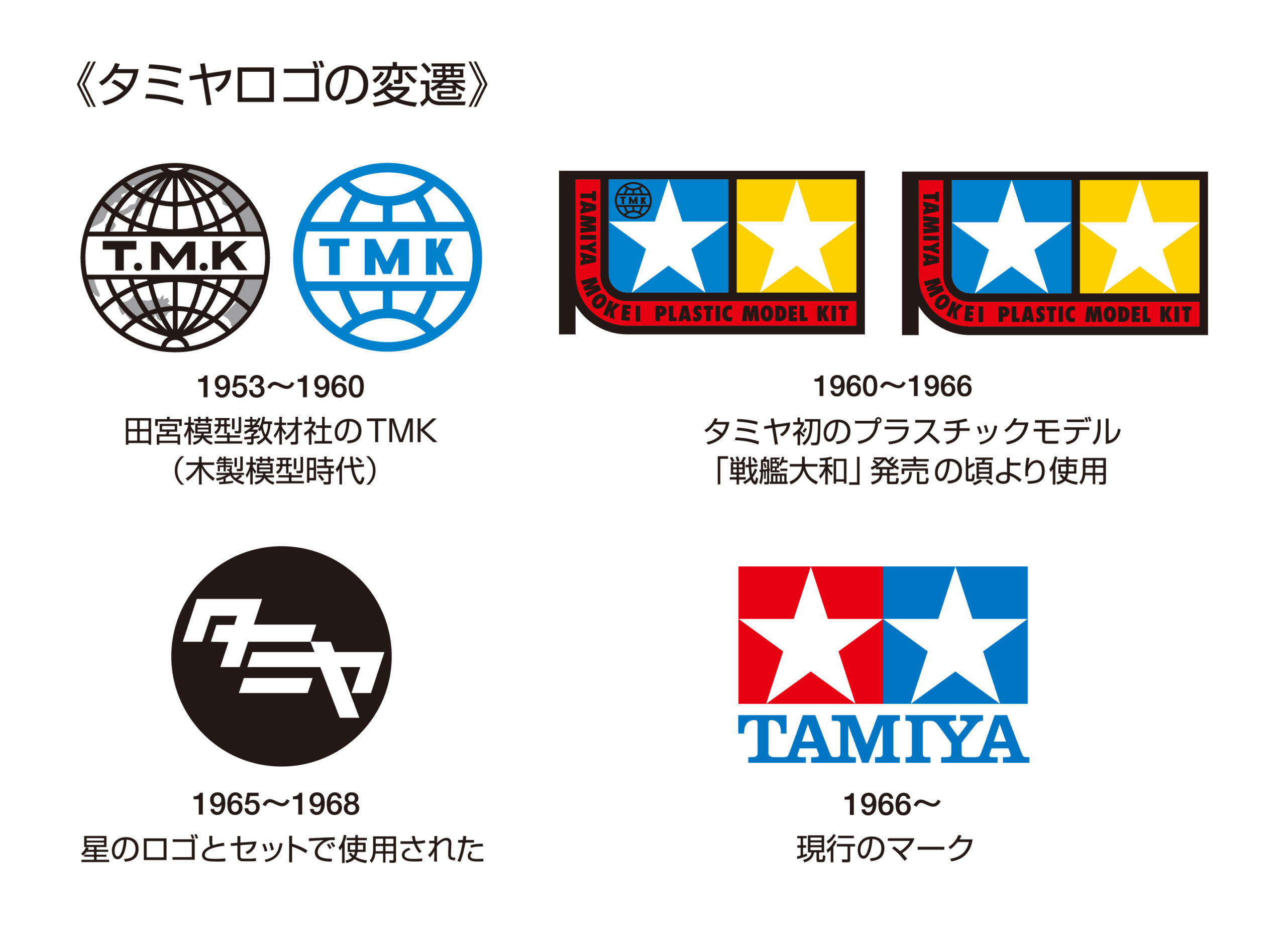
We at TamiyaBlog really appreciate that it has been unchanged now for more then 50 years, especially in the current short-lived times where some other companies which follow ephemeral trends and change it often.
TamiyaBlog
A blog about Tamiya radio control, scale and Mini 4WD models, from vintage classics to future releases.

Like the triple Fleur de lis,
Like Chateau Mouton
Tamiya does not change
Thankfully consistent!
Vive le Tamiya !
There’s another sometimes-used variant you’re missing with just the word Tamiya on a red circle background alongside the stars. It appears in numerous 1980s-vintage models including my Tamiya Fox’s decal sheet. It’s also visible on the Tamiya 66614 logo sticker set (https://www.tamiyausa.com/shop/decal-sticker-sets/tamiya-logo-sticker-set-2/) which you can see in detail here: https://www.lindinger.at/thumbnail/e5/1d/a8/1619040513/9727521_1920x1920.jpg